

Sripalee Sengupta
TL;DR
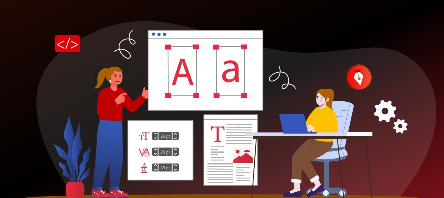
Uncover 2025's best-of-the-best modern display sans serif fonts possessing clarity, multifaceted versatility, and timeless sophistication to elevate branding and create a distinct character. See how effective typography can be in amplifying brand identity across digital, print, and multi-platform platforms.
Typography has never been more than a subtle but significant player when it comes to how we engage with brands, but in 2025, that subtle role has become a center-stage task. More brands than ever now trust contemporary sans serif fonts, and it’s no wonder why. These fonts are simple, elegant, and flexible, providing a unique look that suits a world in which brand identity must remain the same through consistent letters. whenever it appears on a mobile app, highway billboard, product label, or even smartwatch face.
Selecting the top sans-serif fonts in 2025 can be a game-changer when it comes to building your brand image. The good sans-serif font not only makes reading very easy, but it also represents professionalism and modernity. Be it global technology biggies or luxury fashion houses, all of them are leveraging the geometric styles and elegance of crisp sans serif fonts, including Scandinavian sans serif options. to represent their values.
In this blog, we will look at why sans serif is dominating modern brand typography, explain how we selected our top picks, and break down the top sans serif fonts you should consider that serve as a versatile typeface for various applications. for your 2025 branding projects.
Why Modern Brand Uses Sans Serif in 2025?
Modern brands’ love affair with sans serif fonts isn’t happenstance. They have several reasons why they’re the obvious favorite of today’s design requirements, alongside contemporary serif options, which we will highlight :
- Consistent Legibility Everywhere, serif fonts shine regardless of whether they’re on a smartphone, billboards, or packaging. That flexibility makes them a necessity for sans-serif fonts when it comes to web design.
- A Modern and Friendly Voice. The sans-serif typography feels open, friendly, and modern. This is especially valuable for brands trying to connect with younger, tech-savvy audiences. Big names like Google and Airbnb use modern sans serif fonts to convey a message that is both approachable and cutting-edge.
- Accessibility for Different Audiences. Increasing emphasis on inclusive design has led professional sans serif typefaces to become favorites among many brand owners. They can be more easily read by individuals with some types of vision impairment and have better pass rates in digital accessibility scrutiny. Though serif fonts continue to be used in editorial design and high-end print projects, the overall direction in emerging fonts for logos 2025 overwhelmingly tilts toward sans serif. They provide a clean, flexible base upon which to build brand voice across multiple platforms.
Stand out in 2025 with a font that truly reflects your brand personality. INKLUSIVE can guide you in choosing modern sans serif fonts that connect, inspire, and leave a lasting impression, with additional opentype features, and they can be easily downloaded.
Start designing nowTop 12 sans-serif fonts to use for modern brands in 2025
Discover the most versatile, stylish sans serif fonts shaping modern brand identities and elevating design trends in 2025.
1. Lato – Łukasz Dziedzic
Lato, meaning “summer” in Polish, was designed in 2010 and has steadily become a go-to option for digital-first brands, often seen in multiple iterations. Its semi-rounded details give it a warm, friendly vibe while its strong structure keeps it professional.
- Branding psychology: Lato exudes trustworthiness, openness, and friendliness without looking too casual. One can apply it to casual lifestyle brands as easily as to professional corporate ones.
- Why designers love it: Its flexibility ensures it works seamlessly on websites, mobile apps, print pieces, and even packaging for products.
- Distinctive application: Starbucks implements Lato in parts of its mobile application, creating a friendly but reliable feel to the interface.
- Best for: Business sites, minimalist mobile applications, 2025 branding fonts, which must harmoniously combine professionalism with warmth.
2. Montserrat – Julieta Ulanovsky
Montserrat has its roots in vintage urban signage from Buenos Aires’s Montserrat neighborhood. It combines geometric accuracy and a humanist feel to produce a sharp yet friendly appearance.
- Psychology of branding: Montserrat exudes creativity, innovation, and modern sophistication, so it’s a great choice for expressing a progressive image with a sense of culture.
- Why designers adore it: Its geometric form works beautifully with minimalist modern sans serif fonts, yet provides warmth with humanist curves.
- Characteristic use: Instagram provides Montserrat for use as a text font in Stories, a sign of the overall popularity and prevalence of use within social media branding.
- Best for: Fashion labels, design portfolios, lifestyle sites, and current fonts for logos 2025, where personality is equal to readability.
3. Poppins – Indian Type Foundry
Poppins is a geometric sans serif with a sense of orderliness and accuracy. It has a very simple, futuristic look with clean lines, monolinear strokes, and circular forms. Poppins is available with multiple weights, which allows it to be used for various branding possibilities, but feels much the same across the board.
- Psychology of branding: Poppins conveys inclusiveness, lucidity, and newness. It suits tech brands who wish to look high-tech but user-friendly.
- Why designers prefer it: Its wide set of weights and geometric design allows you to instantly set a good hierarchy in type with no typeface changing.
- Notable application: It’s highly favored among fintech start-ups and SaaS businesses because readability on dashboards and mobile apps is highly legible.
- Best for: Modern sans serif typefaces, product brand websites for digital products, fintech websites, tech startups, and educational website pages.
4. PT Sans – ParaType
PT Sans was designed for ParaType to produce on behalf of the Russian Federation under a public type project. Its many languages included within it make it easily translatable to worldwide brand programs. It’s European proportions with a humanist sense that impart formality without stiffness.
- Psychology of branding: PT Sans exudes authority, trust, and clarity. It can be effective in industries where credibility matters.
- Why designers enjoy it: Its powerful multilingual support and harmonious proportions make it a favorite for government, institutional, and international corporate work.
- Typical application: Common in government documents and public service sites used in Eastern Europe.
- Best suited to: Public sector branding, annual reports, global-facing websites, and professional sans serif fonts in formal environments.
5. Roboto – Christian Robertson for Google
Roboto by Christian Robertson at Google has become one of the world’s most-used sans-serif fonts. Geometries blend with friendly curves successfully for a font of minimalist but modern appearance. Its open curves, along with a mechanical outline, give maximum readability on desktop monitors at very small point sizes.
- Psychology of Branding: Balanced, contemporary, friendly. It conveys precision and friendliness.
- Why designers like it: Roboto is the system typeface for Android OS, which means it’s been fine-tuned for readability on a screen. So it’s no surprise it’s popular on apps and sites too.
- Notable use: Android devices’ system font and many Google applications.
- Suitable for: Mobile apps, UI/UX design systems, simple sans serif fonts for tech brand companies.
6. Open Sans – Steve Matteson
Open Sans is a humanist sans serif created for optimal legibility on screens. Its tall x-height, wide apertures, and generous spacing make it exceptionally readable, even at small sizes, especially with its nine weights.
- Psychology of branding: Friendly, approachable, and trustworthy but still highly neutral.
- Why designers adore it: Looks great in various industries owing to its neutrality, along with high readability.
- Distinctive usage: Mozilla’s website, many WordPress themes, and many business websites.
- Suitable for: Blogs, SaaS websites, e-Learning, sans-serif fonts suitable for generic branding.
7. Playfair Display – Claus Eggers Sørensen
Playfair Display is a transitional serif with strong contrast strokes and refined proportions. Though not a genuine sans serif, it complements them beautifully, bringing a sophisticated, high-end feel to brand typography.
- Branding psychology: Sophisticated, luxurious, and ageless chic
- Why designers love it: Ideal for pairing with clean sans serifs like Montserrat or Raleway to create a dynamic brand identity.
- Significant application: Often used in fashion branding, packaging of high-end goods, and luxury editorial design
- Best suited: High-end packaging, sophisticated sans serif font combinations, fashion houses, high-end branding.
8. Raleway – Matt McInerney
Raleway is a sleek, elegant sans serif characterized by thin strokes, tall letterforms, and a distinctive single-storey “a.” It’s often chosen by premium brands that want a minimalist, stylish appearance.
- Psychology of branding: Exclusivity, stylishness,
- Why designers adore it: Ideal for producing slim brand identities with a high-end finish.
- Key application: Luxury skincare businesses, high-end product websites, and minimalist design agencies.
- Best used for: Luxury branding, fashion websites, elegant sans serif fonts for high-end markets.
9. Inter – Rasmus Andersson
Inter is a contemporary sans serif typeface designed specifically for user interfaces, software applications, and digital products. Its high x-height and open forms contribute to being very readable across small mobile displays. Each font family features variable weights and stylistic sets, enabling designers to design flexible modern brand typography using type weights rather than swapping fonts, making it ideal for product packaging.
- Psychology of branding: Implies communication of clarity, effectiveness, and a digital‑first.
- Why designers adore it: Inter was designed for screens, which means it’s an ideal sans serif font for websites and mobile app user interfaces.
- Notable application: Frequently used in dashboards, productivity software applications, and SaaS applications.
- Best for: Technology start-ups, software companies, and any tech‑oriented firm seeking minimalist sans-serif fonts.
10. Source Sans Pro – Paul D. Hunt for Adobe
Source Sans Pro became an open-source typeface in 2012 with Adobe’s initial foray into open-source type design. It was designed by Paul D. Hunt. Breaking new ground for professional digital typography, it retains an early 20th-century American gothic-inspired typeface with a modern, no-frills look combined with a subtle warmth.
- Psychology of branding: Neutrality with warmth, which is very suitable for businesses seeking a mixture of professionalism and friendliness.
- Why designers love it: Its versatility means it works equally well for UI design, corporate communications, and editorial layouts.
- Notable use: Extensively used in design systems, documentation websites, and tech company branding.
- Best for: Technology companies, professional services, education brands, and professional sans-serif typefaces that must work across various industries.
11. Nunito Sans – Vernon Adams, Jacques Le Bailly
Nunito Sans originally consisted of a rounded terminal typeface designed by Vernon Adams but subsequently developed into a complete sans serif family by Jacques Le Bailly. It has a warm, humanistic look that provides a less severe alternative compared to more geometric typefaces.
- Branding psychology: Warmth, friendliness, and accessibility are perfect for brands that want their brand to be seen as community-driven or people-oriented.
- Why designers like it: Combines geometric precision with humanist curves for a font at once unique yet usable for body copy and brand work.
- Notable Usage: Often used by learning platforms, non-profit organizations, and community-oriented websites for its warm personality.
- Best for: NGOs, lifestyle businesses, 2025 brand fonts that need a warm and personal tone.
12. IBM Plex Sans – Mike Abbink and Bold Monday
IBM Plex Sans is the corporate font of IBM, designed in collaboration with Mike Abbink together with Bold Monday. It appeared in 2017 and represents the tradition of innovation and engineering leadership of IBM at first glance.
- Branding psychology: Suggests maturity, sophistication, and authority with features appreciated by technology executives and business professionals.
- Why designers like it: Great for big-league corporate identification with businesslike sans serif faces but sophisticated enough to be employed in marketing pieces and editorials.
- Distinct use: Used throughout IBM’s worldwide print and online content, ranging from annually released reports to UI components.
- Best suits: Technology firms, corporate communication, and international brands that seek an up-to-date sans-serif typeface that could be utilized across languages and cultures.
How INKLUSIVE Uses Sans Serif Typefaces to Energize Modern Brands
At INKLUSIVE, sans-serif fonts are more than a design preference. They are the foundation of how we shape bold and future‑ready brand identities with a contemporary feel. Modern brands demand typography that is adaptable, instantly legible, and effortlessly stylish across every channel, showcasing a strong character. Sans serif typefaces deliver exactly that.
Our process includes getting into the core of your sector background, target market, and brand personality. We then select modern sans-serif fonts that appeal to your positioning and brand voice. To keep our customers a step ahead, we research new and premium typefaces such as:
- GT Walsheim – A geometric sans with personality and warmth. It brings lifestyle and creative brands within reach without sacrificing sophistication.
- Maison Neue – Simple but distinctive. It’s ideal for technology-oriented businesses that seek an elegant, human-centered feel.
- Calibre – Versatile, clean, and modern. It exudes quiet confidence when it comes to premium or corporate branding.
- Söhne – A sophisticated homage to mid‑century modernism. It merges authenticity with contemporary clarity.
These faces will stand out with existing brands because they keep razor-sharp readability small-screen mobile phones to large-budget posters. They convey new thinking and adaptability that speaks to people today. They provide us with stylistic flexibility, too, allowing us to apply them with flawless combinations both to control hierarchy, particularly in headings. and shift tone.
When INKLUSIVE shapes your sans serif strategy, it’s carried out consistently throughout every contact point, such as your website, social media, packaging, presentations, and print advertising. The outcome? Unified, cutting-edge brand presence that’s immediately identifiable and lasting.
Final Take
The right modern sans serif fonts will take your brand places in 2025. They have an element of readability, flexibility, and timeless beauty acceptable to consumers these days. A new rebrand or new start needs your choice of typeface for effective packaging design to decide the perception your customer has about your brand. The top sans-serif fonts this year are more universal than ever before without sacrificing punch, regardless of the device.
Partner with INKLUSIVE to make your typography your competitive advantage. Our experts will guide you in choosing and implementing your fonts that support your brand story, injecting style throughout all your channels with consistency. We will collectively craft your brand that your audience will never forget.
Collaborate with us in developing a typography system that underpins your brand voice. We guide you in selecting, combining, and implementing fonts into an integrated, powerful brand that your audience will never forget.
Contact UsFAQs
1. Ways sans-serif fonts benefit brand image in 2025?
Modern sans serif fonts express a sense of professionalism, flexibility, and clarity, with some options featuring intricate low contrast and an expressive design. which is ideal for companies with a need for communication across a multiplicity of platforms with a common, future-proof image.
2. Which sans-serif typefaces are suitable for 2025 luxury brand typography?
Typefaces such as Calibre, Playfair Display (with a plain sans) provide high-end luxury brands with a high-end feel but with a tremendous amount of flexibility for print and web applications.
3. May I use serif and sans-serif fonts together in my brand?
Yes. Combining a serif like Playfair Display with a sans like Montserrat provides contrast, hierarchy, and a mixture of sophistication with contemporary readability.
4. Why is a sans serif font readable for all types of audiences?
Highly readable sans serif fonts like Open Sans or Lato, along with different fonts, have large apertures, simple letterforms, and generous spaces for enhanced readability for viewers with vision impairment or reading disabilities, ensuring no mistake is made in type selection.