



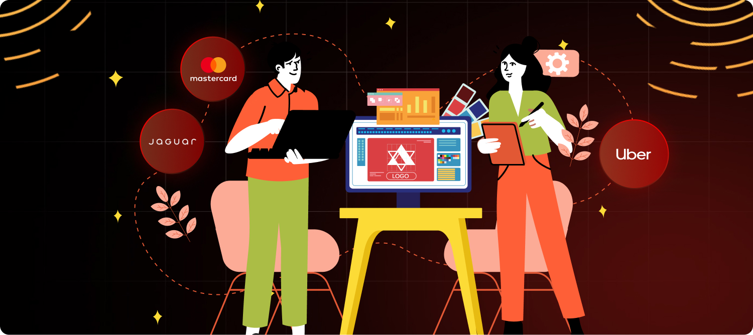
TL;DR
Over the past decade, several major brands have boldly redesigned their logos to modernize their visual identities, stay relevant, and connect with evolving audiences. This blog explores some of the most most successful logo redesign and rebranding examples from recent years, examining why brands chose to revamp their logos and the impact these changes had on their market presence. If you're considering a logo redesign, INKLUSIVE is your go-to partner for creating standout, impactful, easily recognizable logo designs that reflect your brand’s core values and keep you ahead of the competition.
The last decade has been a transformative period for many of the world’s most iconic companies. With a rapidly evolving digital landscape and changing consumer expectations, brands have had to rethink their visual identities, including one of their most critical elements—their logos. Whether simplifying their previous logo designs or completely transforming their brand visuals, these companies understood that a more modern logo now isn’t just about aesthetics; it’s a strategic tool for staying relevant and competitive in an increasingly crowded marketplace.
If you’re considering refreshing your own brand identity, these major logo redesigns from the past 10 years offer valuable lessons. At INKLUSIVE, we specialize in the design process of crafting logos that do more than just look good—they tell a story, reflect your brand’s values, and connect with your audience on a deeper level.
Let’s dive into some of the most famous logo redesigns and how they can inspire your next big branding move.
Why Did So Many Brands Rebrand in the Last Decade?
Over the past 10 years, a surge of brands opted for an updated logo with updated colors and a modern touch with simple design and logo refresh.
Why?
The fast-paced digital landscape, changing consumer preferences, and the need for brand adaptability pushed many companies to rethink their visual identities. Logos, being the face of the brand, often became the focal point for brand identity modernization efforts.
Key reasons why brands rebranded in the last decade include:
- Outdated Designs: As companies moved into the digital age, many found their logos didn’t translate well across platforms like mobile apps and social media. Simplification and versatility became essential.
- Global Expansion: Expanding into new markets meant needing logos that could resonate across different cultures and demographics.
- Consumer Expectations: Minimalist design trends took over, prompting brands to adopt cleaner, simpler logos that were easier to recognize and replicate.
The successful logo rebranding examples from the past decade demonstrate that a logo is more than just a symbol—it’s a visual representation of your brand’s personality.
And that’s where INKLUSIVE comes in. Whether you’re looking to modernize or completely overhaul your existing logo here, our design team is ready to make your rebrand a success.
INKLUSIVE – Your Partner for Standout Logo Design
Let’s start with the best—INKLUSIVE.
While we didn’t undergo a redesign ourselves, we’ve helped numerous brands reimagine their visual identities in the last decade. Our approach to logo design is rooted in personalization, the design process and ensuring that your next new logo design isn’t just trendy, but timeless. Whether you’re a startup or an established company, INKLUSIVE creates logos that resonate with your audience and reflect your brand’s core values.
Why Choose INKLUSIVE?
- Tailored Approach: Unique logos that capture your brand’s essence.
- Full-Spectrum Services: From logo design to full brand identity systems, we offer everything you need for a successful rebrand.
- Fast Turnaround: We deliver high-quality designs on time without compromising on creativity.
Best for: Businesses of all sizes looking to refresh or reinvent their brand identity.
Pricing: Custom pricing based on project scope. Get in touch for a quote!
Use Cases: Startups launching a new product, businesses entering new markets, or companies modernizing their brand for digital platforms.
If you’re ready to take the plunge, contact INKLUSIVE today and sign up for a free consultation! Let’s design your old logo, a new symbol and a new logo together that speaks to your brand’s future.
9 Brands That Got It Right in the Last 10 Years
1. Jaguar – Sleek Evolution for a Modern Era

Jaguar’s updated logo and redesign in 2024 is subtle yet impactful. The luxury car manufacturer refined its iconic leaping jaguar symbol, making it sleeker and more dynamic to reflect the brand’s commitment to innovation and high performance. The polished new design and updated logo emphasize modernity while retaining the brand’s sense of luxury and heritage.
Why: To modernize while retaining the brand’s legacy of power and elegance.
Best for: Legacy brands looking to stay relevant without losing their identity.
2. Mastercard – Simplified for the Digital Age

Mastercard’s logo redesign retained its iconic overlapping red and yellow circles but dropped the text for a sleeker, more versatile look. This minimalist approach made the redesigned logo even more adaptable across digital platforms.
Why: To modernize and enhance versatility across digital and print.
Best for: Brands maintaining classic legacy elements while a modern twist and embracing a modern, sleek, modern aesthetic.
3. Slack – From Playful to Professional

Slack’s logo evolved from a playful hashtag to a structured, geometric design by Pentagram, led by designer Michael Bierut. This shift reflects its growth from a startup to an enterprise tool. The new vector logo, with simplified colors and modular shapes, conveys stability and professionalism. This rebranding aimed to align Slack’s visual identity with its mature market position.
Why: To appeal to a more corporate audience.
Best for: Startups scaling up and looking to reach a broader, more professional market.
4. Uber – Minimalism at Its Best

Uber replaced its stylized “U” with a minimalist wordmark, reflecting its expansion beyond ridesharing. The clean, versatile design supports its diverse services like Uber Eats and Freight, and its global presence. The simple wordmark signifies a mature, tech-forward brand, moving away from a single-service identity.
Why: To reflect their broader service offerings.
Best for: Brands diversifying their products or services.
5. Burberry – Modernizing Heritage

Burberry modernized its heritage by replacing its classic serif font and knight emblem with a sleek, sans-serif typeface. This contemporary update aimed to attract a younger, digitally-savvy audience, reflecting a shift towards a more modern and accessible brand image.
Why: To modernize while maintaining brand heritage.
Best for: Luxury brands aiming to stay relevant to younger audiences.
6. Zara – A Bold Typeface Shift

Zara’s logo redesign, featuring a compressed, bold serif font, was a dramatic and controversial change from its previous iteration. This stark departure sparked significant debate, but undeniably made a powerful statement. The new typography reflects Zara’s bold, fashion-forward aesthetic, aiming to solidify its image as a trendsetting brand, even if the execution was met with mixed reactions. The design clearly aimed to capture attention and emphasize Zara’s strong presence in the fashion industry.
Why: To make a powerful statement bold visual statement.
Best for: Fashion brands looking to make a big deal with an impact.
7. Animal Planet – Playful and Approachable

Animal Planet’s redesign featured updated colors and a playful, modern elephant logo. This aimed to create a more approachable and family-friendly image, reflecting the channel’s shift towards fun and engaging content. The new visual identity sought to appeal to a broader audience.
Why: To appeal to a younger, more dynamic audience.
Best for: Media brands refreshing their brand colors previous a new logo and identity.
8. Dunkin’ – Dropping the Donuts

Dunkin’ strategically removed “Donuts” from its logo to signal a shift beyond pastries, focusing on its expanding beverage and menu offerings. This streamlined rebrand aimed to modernize the brand’s image and resonate with a younger, health-conscious audience. By simplifying the name, Dunkin’ sought to emphasize its broader product range and appeal to a wider consumer base, positioning itself as a versatile, all-day destination.
Why: To reflect expanded product offerings.
Best for: Legacy brands looking to modernize.
9. Dropbox – Minimalism Meets Creativity

Dropbox streamlined its iconic box logo, introducing vibrant primary colors and abstract shapes. This redesign reflected its evolution from simple file storage to a versatile creative collaboration tool for professionals. The minimalist box, combined with the dynamic color palette and shapes, aimed to convey both simplicity and innovation, highlighting Dropbox’s expanded capabilities and its focus on creative workflows.
Why: To reflect a shift towards a broader suite of services.
Best for: Tech companies pivoting or expanding.
Why Choosing the Right Logo Design Agency Matters
Your Logo is the First Impression
Your website and logo is often the first thing people see, and it should convey trust, quality, and professionalism.
More Than Just Visual Appeal
A great logo reflects your brand’s values and connects with your audience emotionally. INKLUSIVE digs deep into your brand’s story to create a lasting impression with a logo that resonates.
Strategic Partnership
INKLUSIVE ensures that your logo not only looks good but aligns with your business goals. We streamline the logo design process, saving you time and delivering results faster.
Evolve with Your Business
We focus on future-forward designs that adapt as your brand grows, ensuring your original logo remains relevant.
The Power of Simplicity
Simple logos are often more effective. At INKLUSIVE, we create logos that work across various digital and physical platforms.
Cost-Effective in the Long Run
A well-designed logo is a long-term asset that drives brand recognition and loyalty. Investing in a professional logo saves money on future logo redesigns.
Timeless Designs
Our logos don’t just follow current trends—they set them. INKLUSIVE ensures your new brand logo is built to last.
Ready to Transform Your Brand? Partner with INKLUSIVE!
At INKLUSIVE, we believe in the power of great logo design to elevate businesses. Whether you’re looking for a complete brand overhaul or a simple, logo change or refresh, we’ve got you covered. Reach out today for a free consultation and let’s craft a logo that speaks to your brand’s future.
FAQs
Why should I invest in a logo redesign for my company?
A successful new logo or redesign signals innovation and relevance to loyal customers. It improves brand recognition and recall and helps your company adapt to changing market dynamics.
How do I know it’s the right time to update my logo?
If your company is evolving, entering new markets, or your old logo no longer works well on digital platforms, it’s time for a redesigned logo or a refresh.
How does INKLUSIVE align its designs with my business goals?
We take a client-focused approach, understanding your brand story and aligning every design element with your business strategy.
How does INKLUSIVE ensure my logo stays relevant?
We focus on timeless, classic design principles and scalability to ensure your logo adapts to future needs.
How can INKLUSIVE benefit my business?
We offer expert website design services that reflect your company’s mission, helping you build a website with a strong, lasting connection with your audience.
What factors should I consider before undertaking major logo redesigns?
Major logo redesigns require careful consideration of your brand identity, target audience, and market trends. At INKLUSIVE, we ensure a thoughtful approach that aligns the logo redesign with your business goals while maintaining brand consistency.
How does a modern logo benefit my brand?
A modern logo conveys sophistication and aligns with contemporary design trends, making your brand more appealing to today’s audience. INKLUSIVE specializes in creating modern logos that are timeless and scalable for various platforms.