


Think about the last time you saw an ad or a logo that caught your attention.
Did the font make an impact?
Fonts are far more than just characters on a page; they are subtle storytellers, conveying emotions, tone, and personality without saying a word.
And when it comes to choosing the right font for your brand or project, the difference between Serif and Sans Serif fonts can be the deciding factor in how your audience perceives you.
Are you aiming for a classic, authoritative feel, or are you going for something sleek, modern, and approachable?
The font families you choose can make all the difference in setting that tone. Whether you’re designing a website, crafting a logo, or fine-tuning a print ad, understanding Serif vs. Sans Serif is key to ensuring your typography works in harmony with your brand identity.
Ready to explore the power of fonts and how they can elevate your designs?
Let’s dive in!
Why Font Pairing Is More Than Just About Style
63% of consumers believe that a well-designed website with a clean, legible font is critical to forming a good first impression of a brand. Choosing between Serif vs Sans Serif is about more than style—it’s about purpose. Here’s why different font pairings are essential:
- Enhancing Readability: Serif fonts improve readability for long text (especially in print). Sans Serif fonts are cleaner and better for short text or digital headings.
- Establishing Hierarchy: Pairing Serif for body text and Sans Serif for headings (or vice versa) creates a clear visual flow and emphasizes key content.
- Building Brand Identity: Serif fonts convey authority and trust, while Sans Serif fonts are modern, approachable, and minimalistic. Font combinations shape both design and brand perception!
Need expert guidance on designing?
What is the Difference Between Serif and Sans Serif Fonts?

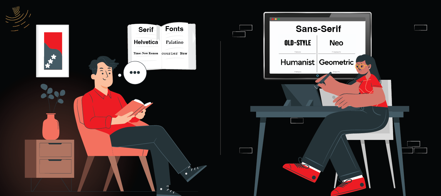
At the core, the difference between Serif and Sans Serif typefaces lies in the thick and thin strokes, extra strokes or small lines that adorn the ends of the letters in Serif typefaces. The term “Serif” refers to these small decorative marks that extend from the ends of a letter’s main strokes, making the characters appear more traditional and formal. Sans Serif fonts, on the other hand, are characterized by the absence of these strokes, giving them a cleaner, more modern appearance.
Serif Fonts
Serif fonts are often described as more classic, formal, and trustworthy due to their historical roots. The serif letters date back to ancient Rome, where inscriptions were carved into stone, and the small marks were added for aesthetic purposes and readability. These fonts work well for printed text and longer bodies of copy, where the extra strokes help guide the reader’s eye along the line of text.
Common Serif typefaces include Times New Roman, Georgia, Garamond, and Baskerville. These fonts are frequently used in print materials like books, newspapers, and academic writing due to their readability in longer passages.
Sans Serif Fonts
Sans Serif fonts gained popularity in the 19th century, with geometric fonts like Helvetica and Arial standing out. These fonts have become the go-to choice for web design and digital content because their clean lines and lack of decorative strokes make them more legible on screen. The simplified letterforms make them easy to read, especially in smaller sizes.
Popular Sans Serif fonts include Arial, Helvetica, Verdana, and Futura. These fonts are often used in modern design, tech branding, and websites because they communicate clarity and minimalism.
Watch this YouTube video to quickly learn the difference between Serif and Sans Serif fonts. Understand how each font style impacts readability and design choices. Get the clarity you need to elevate your next project!
Now that we’ve established the fundamental differences, let’s explore when and why you might choose one over the other.
When Should You Use Serif Fonts?
Serif fonts are ideal when you want to convey a sense of elegance, tradition, or formality. They work best in projects where legibility in longer text is a priority. Here are a few examples of when Serif might be the right choice:
- Books, Newspapers, and Magazines: These fonts help with the readability of long blocks of text. The thin and thick strokes make reading easier on paper and give a more classic feel.
- Legal and Academic Branding: Serif typefaces often evoke professionalism and respectability, which is why they’re popular in industries like law and education.
- Branding for Established Companies: If your brand aims for a more classic or trustworthy vibe, such as in luxury or heritage brands, Serif fonts can help communicate that.
When Should You Use Sans Serif Fonts?
Sans Serif fonts, due to their simplicity and clarity, are ideal for modern and tech-focused designs, representing two styles. They provide clean readability, making them perfect for websites, apps, and advertising, especially when space is limited.
- Digital Content: Since sans-serif typefaces are easier to read on digital screens, they are often used for body text in web design, email campaigns, and app interfaces.
- Tech Companies and Startups: Companies looking for a contemporary, clean, and minimalist look typically use Sans Serif fonts like Helvetica, Arial, or Futura to communicate a sense of modernity and approachability.
- Headings and Display Text: If you’re looking to create emphasis or focus, Sans Serif fonts work well in headings and display fonts due to their bold and impactful look.
Serif or Sans Serif: Which is More Readable?
This is one of the most debated questions in typography. The common belief is that Serif fonts are more readable for printed text because the serifs help guide the reader’s eyes from one letter to the next. However, with the rise of digital content, Sans Serif fonts have become the go-to choice for web readability, especially at smaller sizes.
So, when it comes to readability, there’s no one-size-fits-all answer. It depends on the medium and audience. For long-form print text, Serif fonts might be easier on the eyes, while for web design, Sans Serif fonts provide superior clarity and legibility.
Popular Serif and Sans Serif Fonts
When choosing fonts for your project, it’s helpful to know the best options in each category. Here’s a quick overview of some popular Serif and Sans Serif fonts to consider:
Popular Serif Fonts:
- Times New Roman: A classic serif font often used in newspapers and books.
- Georgia: Known for its legibility in both print and digital formats.
- Garamond: A timeless, elegant font used in high-end print designs.
- Baskerville: A more refined and formal serif often used in books and academic papers.
Popular Sans Serif Fonts:
- Helvetica: A geometric sans serif with a clean, modern feel.
- Arial: One of the most widely used sans-serif fonts, especially on the web.
- Futura: A minimalist font that’s perfect for tech and modern designs.
- Verdana: A font designed for screen legibility.
Myths About Serif and Sans Serif Fonts: Debunking Common Misconceptions
There are plenty of myths circulating about different fonts, including Serif and Sans Serif fonts, contrary to conventional wisdom, and it’s time to clear them up. While there are guidelines for using these fonts, it’s important to remember that typography is about flexibility and context. Let’s debunk some of the most common myths.
Myth 1: Serif Fonts Are Always More Formal

While it’s true that Serif fonts often carry a sense of formality or classic design, they are not always the most formal option. Some Sans Serif fonts can also feel traditional and classic, depending on how they’re used.
For example, pairing a classic Serif font with a modern Sans Serif font can still achieve a timeless, formal look. The right combination can make a Serif feel modern, and a Sans Serif font can evoke a classic touch, so don’t restrict your choices to rigid assumptions.
Myth 2: Sans Serif Fonts Are Only Good for Headlines

Although Sans Serif fonts are commonly used for headings or subheadings, they are also effective in other contexts. Serif fonts can be used for headlines and may even be more attention-grabbing in certain designs, particularly in print materials.
Take a look at newspapers—they often use bold Serif fonts in their headlines to capture attention. Don’t be afraid to experiment with Serif fonts in your headings for a change.
Myth 3: Serifs Are for Print, Sans Serifs Are for the Web

It’s a common belief that Serif fonts should only be used in printed materials and Sans Serif fonts are better suited for the web. However, this is no longer the case. Many Serif fonts are designed to look great on screens.
Fonts like Georgia are widely used for web content because they are optimized for digital platforms. Similarly, Sans Serif fonts are effective in both print and digital designs. The secret lies in choosing the right font for your medium.
Supercharge Your Marketing with The INKLUSIVE
Are you tired of design bottlenecks slowing down your team’s graphic design process? The INKLUSIVE is here to provide on-demand design services that scale with your needs. Whether you need presentation design, social media graphics, or website layouts, our subscription service offers quick turnaround times without sacrificing quality with modern typefaces.
Why Choose The INKLUSIVE?
Comprehensive Design Solutions: We’ve got every creative project covered from infographics to motion design.
Fast & Flexible: Get designs delivered swiftly, tailored to your unique requirements.
Affordable Packages: Our 5-Hour Pack is only $199, perfect for small projects or a quick taste of our services.
Ready for seamless creativity?
Final Thoughts
The choice between Serif and Sans Serif fonts isn’t a matter of which is objectively better, but rather which is more suited to your graphic design’s purpose, audience, and medium. Both font types have their unique strengths, whether you’re aiming for a classic, formal feel with Serif, or a modern, clean approach with Sans Serif.
By understanding particular fonts’ key differences, you can make a more informed decision and elevate your design work. Whether you’re creating logos, web pages, or printed materials, your font choice will make a lasting impression on your audience, so choose wisely!
Ready to Choose Typography That Fits Your Brand?
If you want design choices that strengthen clarity, personality, and visual impact, INKLUSIVE can help you create branding that leaves a lasting impression.