





TL;DR
A well-crafted brand guide ensures consistency in how your brand looks, sounds, and feels across every channel, showcasing great brand guidelines. From logo usage and color palettes to typography and tone of voice, it keeps internal teams and external partners aligned. The result? A brand that’s instantly recognizable, trusted by audiences, and ready to scale without ever losing its identity.
Scroll. Skip. Swipe.
That’s how fast your audience moves, and if your brand doesn’t stop them in their tracks, it vanishes. Too many businesses still think a logo and two fonts are enough. They’re not. A brand today needs presence, personality, and precision.
You need more than “looking good”; you need to feel unforgettable across every touchpoint. Whether you’re launching something bold or reworking a brand that’s fallen flat, it starts with clarity and consistency. Because if your audience doesn’t recognize you, they’ll never remember you. Want a brand that earns attention, not just asks for it? Let’s talk about real identity.
Why brand guidelines are non-negotiable
Think of brand guidelines as your brand’s immune system. Research has found brands that maintain a strong message with consistent identity across all channels can increase revenue by up to 33%. Demand for consistency is serious, especially when you consider that 81% of consumers refuse to buy from brands they don’t trust. Meanwhile, visibility jumps 3.5× for brands who nail consistency across visuals and messaging.
Moreover, a brand guide isn’t a static document; it’s a living blueprint that evolves with your business, ensuring your identity remains aligned with growth and new market expansions.
Here’s what happens when your brand guide hits the mark:
- Everyone stays on-brand from social media and packaging to website and email campaigns.
- Logo usage, typography rules, color palettes, brand assets, and usage terms become easy reference points.
- Both internal teams and external partners get crystal-clear visual examples, messaging do’s and don’ts.
- You lock in brand values, core messaging, voice, and personality—ensuring every touchpoint resonates.
Simply put, a strong, detailed, branded document doesn’t just define how to look and sound. It ensures your brand lives and breathes consistently across every platform, building recognition and trust every step of the way.
Ready to make your brand instantly recognizable?
If your logo, voice, and visuals don’t align, your audience won’t either. Let us help you build a bulletproof brand guide that keeps every message consistent, every touchpoint powerful, and your brand unforgettable.
Get My Brand GuideWhat Every Professional Brand Guide Must Include
A comprehensive and usable brand guide goes beyond mere aesthetics; it’s a strategic tool that defines how your brand will consistently appear, sound, and feel across all channels. Based on industry best practices, a professional brand guide should include:
• Logo Usage Rules: Clear instructions ensuring your logo remains impactful and protected. This covers acceptable usage, size ratios, defined safe spacing, format variations (light/dark, stacked/horizontal), and crucial examples of misuse to prevent dilution.
• Color Palette Development: Precise definition of your brand’s primary, accent, and neutral colors. This includes exact HEX, RGB, CMYK codes, and often Pantone codes, along with naming conventions for seamless brand-wide adoption across digital and print platforms.
• Typography Standards: A consistent typographic system outlining font families, weights, sizes, line heights, and usage hierarchy for various applications in both digital and print formats, ensuring readability and brand personality.
• Tone of Voice & Messaging: Guidance on your brand’s unique voice (e.g., formal, casual, playful) through written examples, specific “do’s and don’ts,” and how this tone should be applied across diverse touchpoints like social media, customer interactions, and marketing copy.
• Imagery Guidelines: Specifications for photography style, iconography, and illustration choices that define how your brand should visually represent itself across all channels, ensuring visual cohesion and emotional resonance.
• Platform-Based Usage Guidance: Templates, assets, and design systems for specific platforms such as print, digital, landing pages, and social media, ensuring consistent application and ease of use for all stakeholders.
• Mission, Vision, and Values: A foundational statement outlining what your brand stands for, its core purpose, and what it aspires to achieve, guiding all brand expressions.
• Living Document Approach: A commitment to the brand guide being regularly updated and evolved as the brand grows, rebrands, or expands to new markets, ensuring it always remains current and accessible.
A Breakdown of 14 Brand Style Guides You Can Learn From
These real-world brand book examples show how strong brand guidelines bring consistency and charisma together. You’ll see how top brands create bold visuals, adopt a smart tone of voice, reinforce brand recognition, and build brand architecture that scales.
1. Patagonia
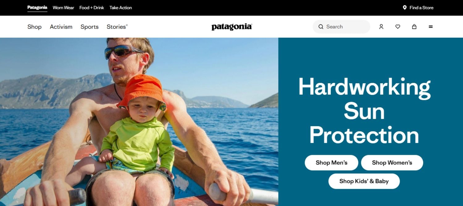
Patagonia’s brand style guide is rooted in the brand’s mission to protect the planet. The entire visual identity from color choices to typography is aligned with values of sustainability, authenticity, and adventure. Its branding and style guide offers clarity across all design and messaging touchpoints.
Why it Inspires
- Earth-toned color palette reflects Patagonia’s outdoor ethos, with detailed HEX, RGB, and CMYK codes.
- Precise logo usage instructions, including spacing, size limits, and misuse examples, ensure brand consistency.
- Voice guidelines are purpose-driven, promoting a tone that’s honest, activist, and clear.
- Authentic imagery guidelines encourage natural, unscripted visuals of real outdoor experiences.
Key Takeaway
Patagonia’s branded document is a perfect example of how brand guidelines can serve as a values-first blueprint. It’s more than a collection of rules as it’s a guide to expressing purpose through consistent brand assets, tone, and visuals that resonate with the right audience, making it a great example ..
2. Spotify

Spotify’s branding and style guide captures what the brand stands for: energy, creativity, and rhythm. Every component of their brand guide supports a consistent user experience while amplifying Spotify’s distinct identity and expressive, music-forward brand identity.
Why it Inspires
- Dominant green primary color paired with bold accents, clearly defined with color codes.
- Well-documented logo usage across ads, screens, thumbnails, and music partnerships.
- Structured typography rules balance expressiveness with readability across mobile and web.
- Offers downloadable brand assets and presentation templates for internal teams and collaborators.
Key Takeaway
This is a standout brand style guide example that merges design consistency with creative freedom. Spotify shows how effective brand architecture that grounded in tone, visuals, and guideline to create a clear, scalable identity across global markets.
3. Duolingo

Duolingo’s brand style guide is filled with energy and clarity, reflecting its fun-first approach to learning. From its cheerful color palette to its unmistakable mascot, everything in the brand guidelines works together to create a brand that’s consistent, lovable, and user-centric.
Why it Inspires
- Signature green and friendly accents are listed with precise HEX and RGB values to ensure visual consistency.
- Clear logo usage rules for Duo the owl across web, app, and email formats.
- Unique typography supports playful, readable messaging across devices.
- The tone of voice section explains how to sound both casual and trustworthy across touchpoints.
Key Takeaway
Duolingo’s brand style guide example blends visual coherence with charm. It’s a great reference for companies that want their branding and style guide to reflect personality without losing control over their brand assets and brand voice.
4. Vans

Vans’ brand style guide captures the spirit of skate culture – raw, rebellious, and creative. It balances strict structure with space for individuality, allowing the brand to maintain consistency without losing its edge. Their branding and style guide reflects how a brand rooted in subcultures can still scale globally through clarity and cohesion.
Why it Inspires
- Iconic checkerboard visuals are backed by clear visual identity guidelines including spacing, sizing, and placement.
- Encourages creative interpretation by allowing flexibility in typography, colors, and layouts.
- Features visual examples across packaging, retail, and digital that reinforce tone and mood.
- Highlights logo usage rules that preserve legibility without stifling artistic expression.
Key Takeaway
This is a great branding guide example for companies with a youthful, evolving customer base. Vans proves that well-defined brand assets and adaptable brand architecture can co-exist by giving teams a framework to stay on-brand without limiting creative flair.
5. Mailchimp

Mailchimp’s branding and style guide is a masterclass in personality-meets-precision. It shows how a company can be fun without feeling unprofessional by following detailed brand guidelines . Their visual and verbal identity is unified across every platform through a rich set of brand assets, clear design rules, and voice guidelines.
Why it Inspires
- Vibrant yellow primary color, paired with neutrals and custom hex codes for consistent application.
- Extensive logo usage section that includes mascot treatments, icon variations, and lockup rules.
- Distinct tone of voice guidelines define how to write copy that’s witty, human, and helpful.
- Organized typography rules for hierarchy, spacing, and alignment across marketing and product materials.
Key Takeaway
Mailchimp’s brand style guide is ideal for companies with strong personalities. It shows how documenting tone, layout, and visual identity guidelines can help internal teams and partners maintain both consistency and character across all brand expressions.
6. Dropbox

Dropbox’s brand guide is engineered for usability. It presents a clean and modular system that supports its functional brand ethos. With a clear focus on scalability, accessibility, and precision, Dropbox ensures that all brand assets and visuals, including brand colors, are universally aligned across platforms and teams.
Why it Inspires
- A cool-toned color palette with detailed HEX, RGB, and CMYK values to support consistency across web and print.
- Grid-based logo usage rules ensure precision in placement across UI and print media.
- Practical typography rules prioritize clarity, spacing, and accessibility across screen sizes.
- UI examples showcase consistent button styles, icon usage, and grid systems within both product and marketing designs.
Key Takeaway
Dropbox’s brand style guide example is perfect for brands focused on minimalism and user-friendliness. It proves that by aligning visual identity guidelines with thoughtful UX decisions, companies can scale their brand with both efficiency and coherence.
7. Uber

Uber’s brand style guide is designed for scale. Built for global operations, it provides adaptable rules that work across cultures and touchpoints. From app screens to out-of-home advertising, Uber’s branding and style guide reflects a modular brand architecture that supports hyper-growth while staying unmistakably Uber.
Why it Inspires
- A minimalist black-and-white color palette is supported by regional accent colors, all with exact HEX and RGB values for print and digital consistency
- Logo usage instructions specify size, safe zones, and placement across mobile apps, merchandise, and billboards.
- Voice and tone guidelines define clear, respectful, and accessible messaging for both drivers and riders.
- Sub-brand identity rules (e.g., Uber Eats, Uber Freight) ensure visual alignment while allowing for tailored messaging.
Key Takeaway
Uber’s example brand guide is a blueprint for high-growth brands operating across regions. It shows how scalable brand identity guidelines, flexible brand assets, and a modular design system can power consistency from app icons to service ads.
8. Google
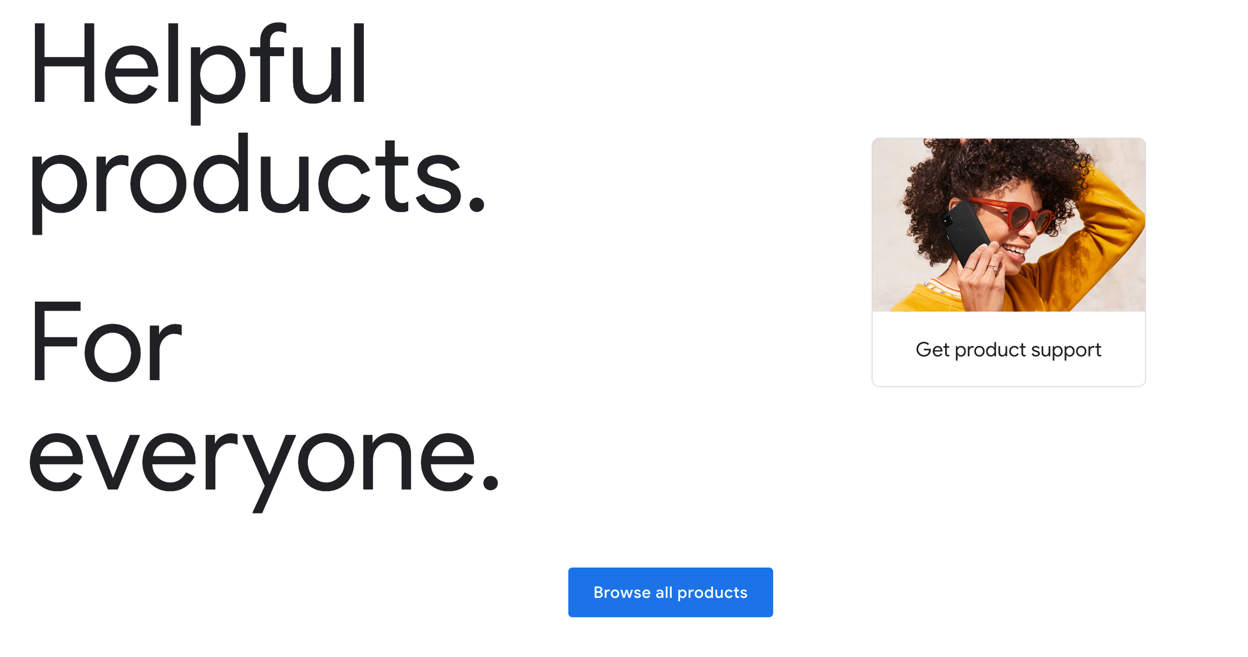
Google’s branding is iconic and ever-evolving. Its brand guide takes complexity and turns it into simplicity through structured yet flexible visual identity guidelines. Focused on user experience and digital design, Google’s system is a reference point for tech-first companies trying to maintain consistency across thousands of digital touchpoints.
Why it Inspires
- The four-color logo system is supported by single-color and dynamic variations with detailed brand asset usage rules.
- Google’s typography is rooted in Material Design standards, outlining font weights, hierarchy, and UI use across mobile and web.
- Clear iconography and animation guidelines ensure cohesion in micro-interactions and product flows.
- Voice and tone principles promote clarity, inclusivity, and friendliness across marketing copy, product messaging, and help content.
Key Takeaway
Google’s brand style guide proves that even complex, evolving companies can remain instantly recognizable. With robust brand architecture, adaptable design systems, and structured brand guidelines, consistency never gets lost in scale.
9. Nike
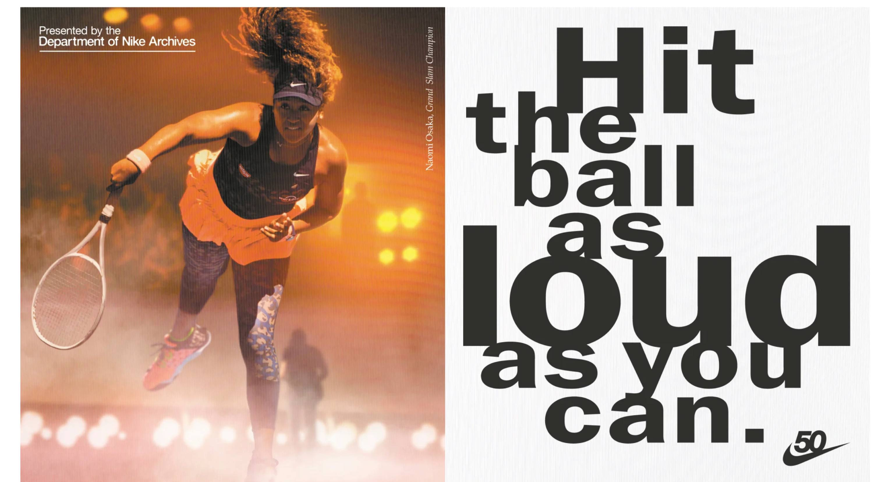
Nike’s branding is bold, emotional, and instantly recognizable. Its brand style guide is built around powerful storytelling. Each brand asset from typography to visuals is treated as a medium to inspire, empower, and connect with its community. Nike doesn’t just follow rules as it makes them iconic.
Why it Inspires
- The swoosh logo has strict usage rules, including minimum size, white space, and permitted color combinations.
- The color palette is anchored in monochromes with red accents, tailored for high contrast and energy.
- Typography is purposeful: strong headlines and clean sans-serif body fonts drive clarity and inspiration.
- Visual identity guidelines push for action-oriented photography and athlete storytelling that fuels emotion and brand recognition.
Key Takeaway
Nike’s branding and style guide is proof that emotional storytelling and visual consistency are not opposites. By aligning voice, visuals, and identity across platforms, Nike shows how to build a brand that’s not only consistent but legendary.
10. Airbnb

Airbnb’s brand style guide brings its mission “belong anywhere” is to life through visuals, messaging, and design systems. Its branding and style guide isn’t just about aesthetics; it’s a tool for building emotional resonance across every touchpoint. From logo usage to image tone, every detail helps reinforce the brand’s promise of inclusion and trust.
Why it Inspires
- A warm and inviting color palette built around blush tones and neutrals, defined by HEX and RGB codes for consistency across print and digital.
- The Bélo logo has detailed usage instructions: spacing, sizing, background contrast, and treatment for app icons and signage.
- Typography rules focus on modern, humanist sans-serif fonts that promote accessibility and warmth.
- Visual identity guidelines include authentic photography of real travelers and hosts, highlighting diversity and local culture.
- Voice and tone emphasize friendliness, inclusion, and clear communication in listing pages, help articles, and promotional campaigns.
Key Takeaway
This brand style guide example proves that emotional storytelling, paired with consistent brand assets and messaging guidelines, can build a human-centric brand identity that scales globally while remaining personal.
11. Slack

Slack’s brand guide is built for utility, clarity, and a bit of fun perfect for a productivity tool with personality. The company balances structure and character by combining clean design with a brand voice that’s both helpful and human. Slack’s branding and style guide ensures every interface, notification, and brand touchpoint feels unified and delightful.
Why it Inspires
- A neutral base palette is accented with vibrant color pops, all carefully documented with HEX and RGB codes for digital consistency.
- Logo usage is well-defined for use across app icons, integrations, and social media with clear spacing, alignment, and placement rules.
- Typography rules support hierarchy and clarity, using rounded, legible sans-serif fonts for readability in high-speed environments.
- Visual identity guidelines include UI components, layout grids, and templates for social posts and product walkthroughs.
- The tone of voice is casual yet professional by providing messaging do’s and don’ts to guide user communication and campaign copy.
Key Takeaway
Slack’s brand style guide showcases how brand documentation can strike the perfect balance between usability and identity by making it easier for teams to keep messaging and visual systems consistent across every interaction.
12. Coca-Cola
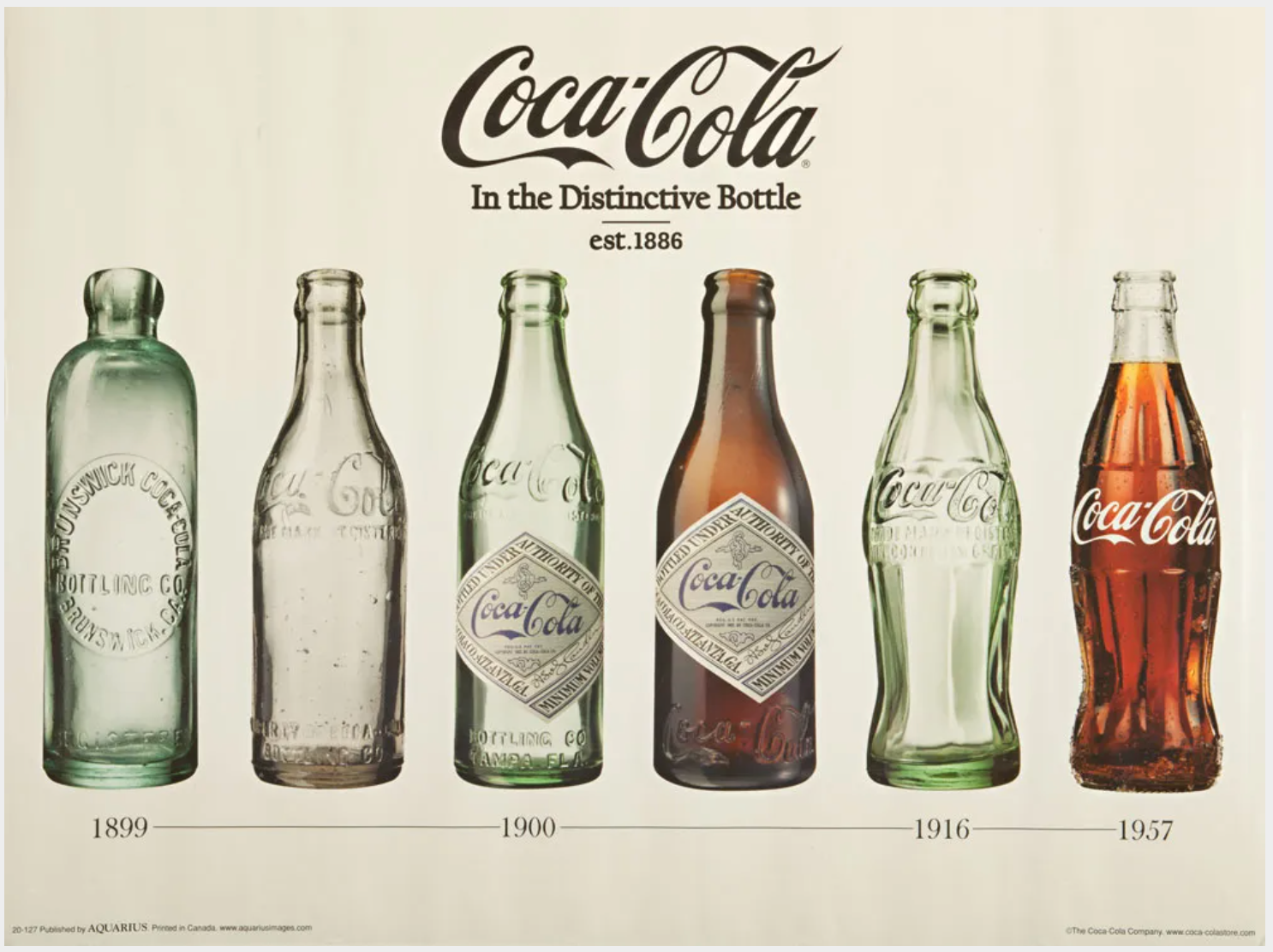
Coca-Cola’s branding stands as a global gold standard for legacy brand management. Its brand guidelines have evolved over decades without losing visual equity. This brand book example demonstrates how careful design systems and clear identity rules help maintain global recognition while adapting to new channels and formats.
Why it Inspires
- Coca-Cola red is locked with Pantone, CMYK, and HEX codes for absolute consistency across packaging, signage, and merchandise.
- Logo usage rules include sizing, spacing, monochrome versions, and examples of incorrect treatments to prevent visual dilution.
- Typography guidance covers the classic Spencerian script along with modern typefaces for digital readability.
- Imagery rules highlight lifestyle photography that evokes joy and togetherness that aligned with the brand’s core messaging.
- Sub-brand identity systems ensure seasonal campaigns and limited editions (like Coca-Cola Zero or holiday cans) still align with the master brand’s visual identity.
Key Takeaway
Coca-Cola’s brand style guide is a timeless blueprint. It shows how strict logo usage, legacy typography, and consistent brand architecture allow even heritage brands to innovate while staying deeply recognizable.
13. Netflix

Netflix’s branding and style guide is a masterclass in intentional simplicity. As a global leader in streaming, their brand thrives on consistency across every screen and channel. From thumbnails to posters, every design decision reflects clarity, impact, and recognizability—making it an excellent brand guide example for startups and media companies alike.
Why It Inspires
- Highly visual slides and poster art are created using a bold color palette: Netflix red, black, and white each with clear HEX and CMYK codes.
- Logo usage rules specify background contrast, spacing, and correct placement across devices and digital interfaces.
- Typography guidelines support clean hierarchy across web, mobile, and print—perfect for company presentation templates.
- Imagery guidelines emphasize strong emotional visuals and cinematic storytelling.
- Voice and tone are sharp, concise, and high-impact perfect for teaser copy and app prompts.
Key Takeaway
Netflix proves that when your presentation design and brand assets follow a tight structure, your brand becomes instantly memorable and visually iconic across platforms.
14. Adobe
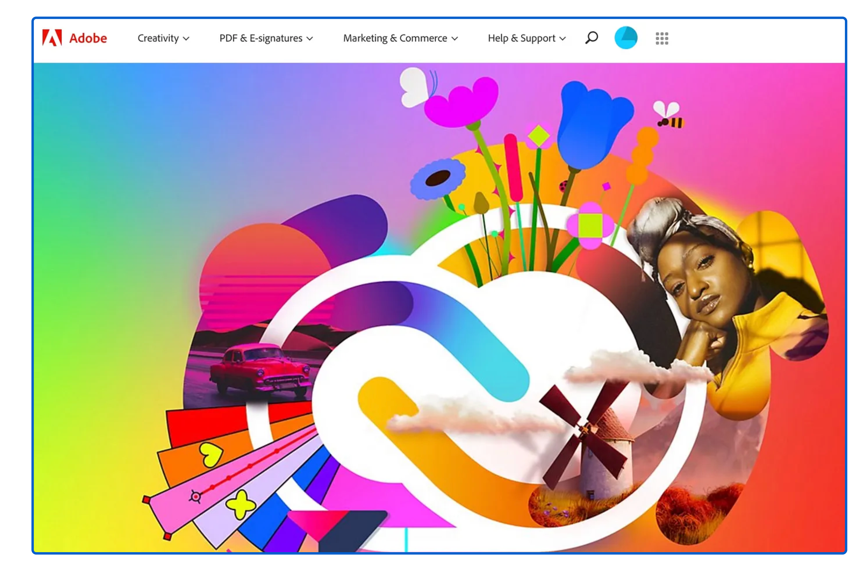
As a brand built for creators, Adobe’s branding and style guide blends structure and imagination. It empowers internal teams and external partners to create without compromising consistency by making it an ideal reference for any presentation design agency or enterprise aiming for global reach.
Why It Inspires
- Color palette guidelines include modular swatches with complete HEX, RGB, and CMYK values for UI, web, and product branding.
- Logo usage rules span across software splash screens, marketing assets, and presentation slides backed by clear visual identity guidelines.
- Typography hierarchy is defined for titles, product interfaces, and editorial content with proper spacing and alignment.
- Imagery standards cover photography, icons, and illustrations used across tutorials, ads, and internal decks.
- Brand voice and tone cater to professional yet inspiring messaging in newsletters, user guides, and presentations.
Key Takeaway
Adobe shows how combining presentation design, brand architecture, and structured brand guidelines helps teams consistently create powerful and recognizable brand experiences across the globe.
Why Choose INKLUSIVE for Your Brand Guide
At INKLUSIVE, we don’t just design brand guides we craft them as strategic tools to power your brand’s clarity, consistency, and memorability. Our process begins with what matters most: defining your brand identity. We work with you to clarify your mission, vision, values, audience, and brand personality. These foundations shape every decision, from tone of voice to typography.
Once the identity is in place, our team builds a comprehensive and usable brand guide that includes:
- Logo Usage Rules: We ensure your logo remains bold and protected with clear dos and don’ts, size ratios, spacing, format variations (light/dark, stacked/horizontal), and misuse examples.
- Color Palette Development: INKLUSIVE curates and codes your primary, accent, and neutral colors across HEX, RGB, and CMYK formats with naming conventions for easy brand-wide adoption.
- Typography Standards: We define a consistent typographic system, covering font families, weights, sizes, line heights, and usage hierarchy for both digital and print formats.
- Tone of Voice & Messaging: We guide your brand voice whether formal, casual, or playful and provide written examples, do’s and don’ts, and tone applications across touchpoints like social media and customer interactions.
- Imagery Guidelines: From photography style to iconography and illustration choices, we define how your brand should visually show up across every channel.
- Platform-Based Usage Guidance: INKLUSIVE ensures your brand remains consistent across platforms, providing templates, assets, and design systems for print, digital, landing pages, and social media.
- Living Document Approach: Your brand evolves, and so should your brand guide. We make updates easy, keeping the guide current and accessible to all stakeholders, internal teams and external partners alike.
Whether you’re launching a new business or evolving an existing brand, we delivers brand guidelines that go beyond theory. We provide editable assets, ready-to-use templates, and on-demand creative support so your brand always remains aligned, professional, and ready for what’s next.
Ready to build a distinctive, consistent, and memorable brand identity? Let us help you craft a powerful brand guide tailored to your business.
Connect with usFinal Thoughts
A great brand guide doesn’t just define how your brand looks as it shapes how it’s remembered. As you’ve seen from the 14 brand guide examples above, consistency in brand elements like logos, color palettes, typography, and tone of voice is key to building trust and recognition. Whether you’re a growing startup or an established company, having a comprehensive brand manual ensures every touchpoint delivers the same message and feeling.
At INKLUSIVE, we specialize in creating tailored brand guidelines that bring clarity, creativity, and cohesion to your visual identity. From brand architecture to detailed usage terms, we help you build a brand that resonates deeply.
Want to turn your brand into a cohesive, memorable experience across every platform? Let us craft your complete brand guide with clarity and creativity.
Build Your BrandFAQs
1. How do brand guidelines support consistent branding?
Brand guidelines provide clear instructions for using logos, typography, imagery, and tone. By aligning all brand assets under one visual identity system, you ensure consistency in marketing, presentations, and communication, essential for long-term brand recognition.
2. What should a professional brand guide include?
A professional brand guide should include logo usage rules, color palettes (with HEX and RGB values), typography hierarchy, tone of voice, imagery style, and usage terms. These branding essentials help internal teams and external partners maintain consistency.
3. How does a brand style guide help with marketing presentations?
With a detailed brand style guide, your marketing presentations stay on-brand. Fonts, layouts, color schemes, and tone stay unified, enhancing credibility and visual impact across pitch decks, client proposals, and brand campaigns.
4. How often should I update my brand guide?
Review your brand guide yearly or whenever you rebrand, launch a new product, or expand to new markets. Keeping branding and style guide documentation current ensures your visual identity stays aligned with business growth.