

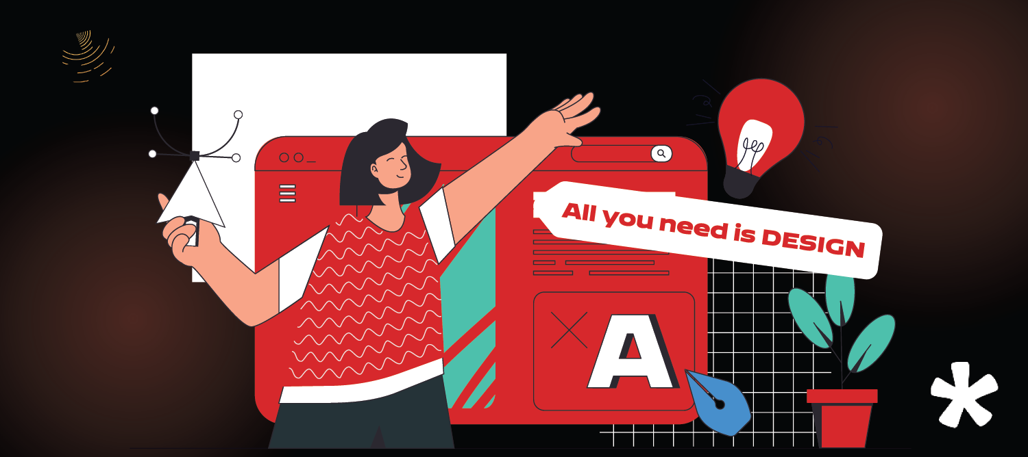

TL;DRTypography refers to more than just picking fonts—it's about building visual communication through effective typography, which includes the use of white space as well as background. The right typography, from typographic illustrations to font size, pairings and individual letters, creates impact, clarity, and emotion across every design touchpoint.Typography That Talks: Why It’s More Powerful Than Ever
You know that feeling when a brand just gets you, before you’ve even read a single word?
That’s typography doing the heavy lifting.
I once opened a pitch deck from a startup with Comic Sans as their headline font.
It wasn’t a joke, and neither was my instant loss of trust. Fonts have feelings, and in the real world, they’re either building credibility or quietly killing conversions.
So, what is typography in graphic design, really?
It’s more than pretty letters.
It’s the art and psychology of arranging text to speak without saying a word. It tells people who you are before your message even lands.
In this blog, we’ll unpack why bold, intentional typography design matters especially in high-stakes spaces like branding, UX, and storytelling. From typography examples to graphic designer ideas that spark trust, action, or awe we’ll show how the right font can literally close deals.
Ready to feel fonts differently?
Why Typography Isn’t Just Minimalist Design: It’s Strategy
Typography transcends mere aesthetics; it’s a strategic tool that profoundly influences user perception and behavior, especially when used with greater contrast. A staggering 75% of users judge a brand’s credibility based solely on its typography choices.
Different typefaces evoke distinct emotions and associations, but certain common mistakes can hinder their effectiveness. Serif fonts often convey tradition and reliability, making them suitable for sectors like finance or law. Conversely, sans-serif fonts project modernity and approachability, ideal for startups or tech companies.
Typography also plays a pivotal role in user experience, especially when considering body text. Studies indicate that legible typography can increase user satisfaction by 30%. Moreover, consistent typography across platforms strengthens brand identity, with 60% of consumers more likely to remember brands that present a cohesive visual framework.
In essence, typography is not just about selecting attractive fonts; it’s about crafting a visual communication for your brand’s values, enhances user engagement, and guides decision-making.
Types of Typography in Graphic Design (And When to Use Them)
Typography is more than just selecting fonts; it’s about choosing the right typeface to convey your brand’s message effectively, which involves understanding key typography design terms. A solid understanding of type design and the various types of typography can help you make informed decisions in your design projects.
1. Serif Fonts
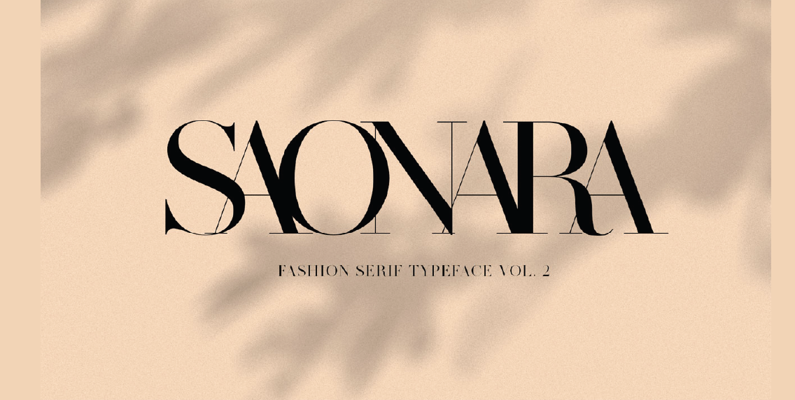
Characterized by small lines or strokes attached to the end of larger strokes in letters, serif fonts exude tradition and reliability. They’re commonly used in print media, such as newspapers and books, due to their readability. Examples include Times New Roman and Georgia.
2. Sans Serif Fonts
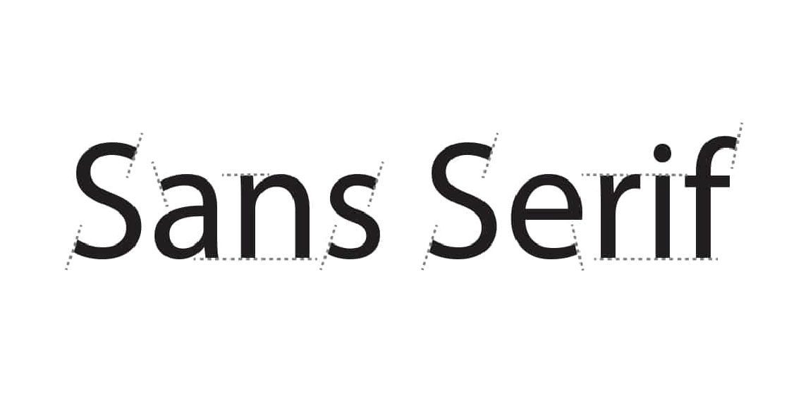
Sans serif fonts lack the decorative strokes found in serif fonts, offering a clean and modern appearance. They’re widely used in digital media, including websites and mobile apps, for their clarity on screens. Popular examples are Arial and Helvetica.
3. Script Fonts
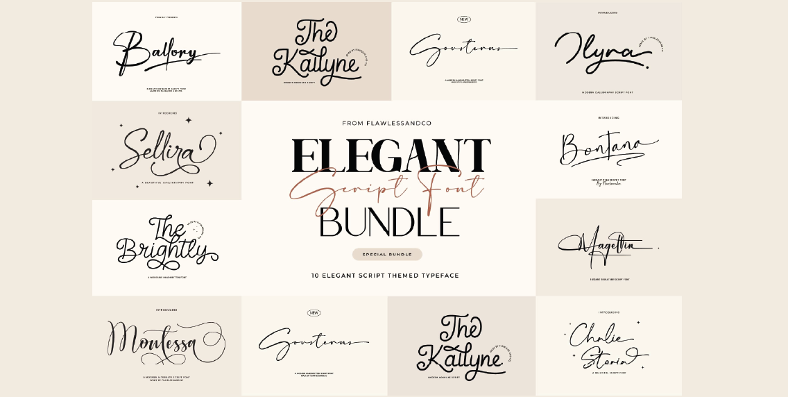
Script fonts mimic cursive handwriting, conveying elegance and creativity. They’re often used in invitations, logo design, and headings to add a personal touch. Examples include Brush Script and Pacifico.
4. Display Fonts
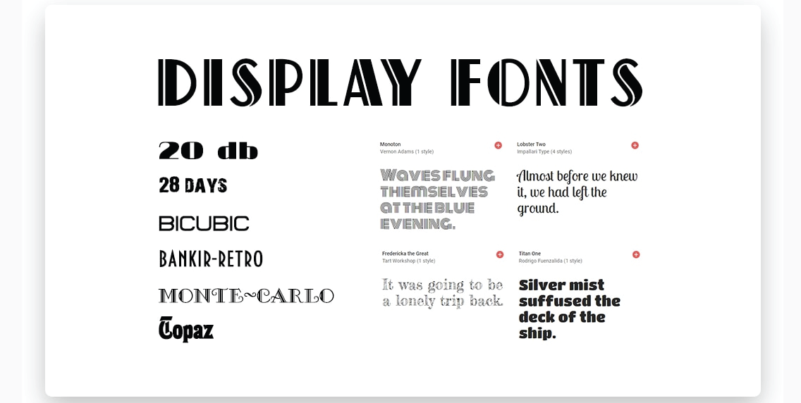
Designed for attention-grabbing headlines, display fonts are decorative and best used sparingly. They add personality to designs but can be overwhelming if overused. Examples include Impact and Lobster.
5. Handwritten Fonts
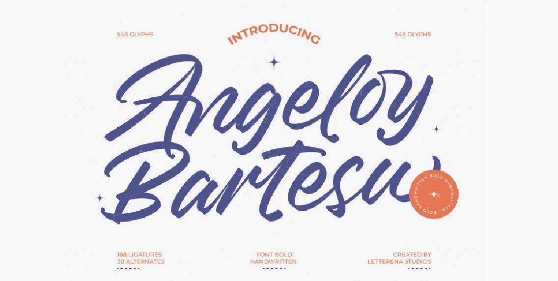
These fonts emulate natural handwriting, adding a casual and friendly feel to designs. They’re suitable for creative projects like greeting cards and personal blogs. Examples include Comic Sans and Dancing Script.
6. Monospaced Fonts
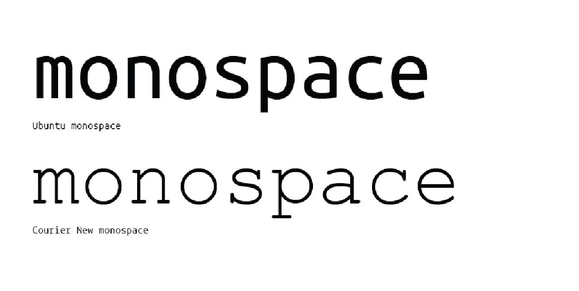
Each character in monospaced fonts occupies the same amount of horizontal space, making them ideal for coding and tabular data. Examples include Courier and Consolas.
7. Variable Fonts
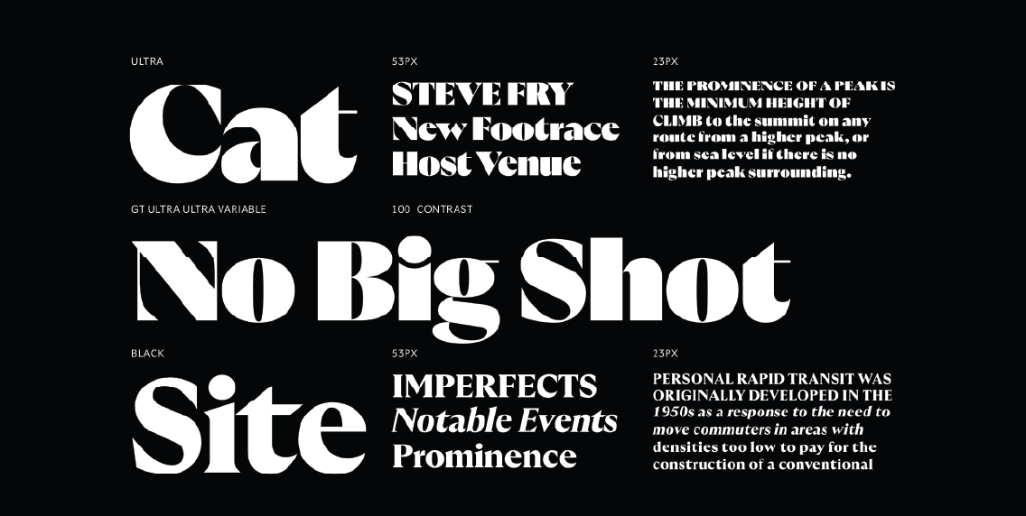
Variable fonts allow for multiple styles within a single font file, offering flexibility in design. They’re efficient for responsive design, adapting seamlessly across different devices.
Understanding these types of typography and their appropriate applications can significantly enhance your design’s effectiveness and aesthetic appeal.
10 Cool Typographic Design Ideas to Try Right Now
Typography is one of the most expressive tools in a designer’s kit. It’s not just about making words readable, it’s about giving them character. Whether you’re building a brand, shaping user experience, or crafting a visually appealing identity, typography can set the mood, stir emotion, and spark action.
Let’s explore 10 cool typography designs you can experiment with to break boundaries and create designs that speak louder than words.
1. 3D Typography
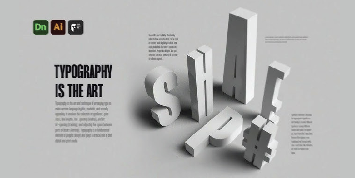
What it is: Typography with depth, shadows, and gradients that create a 3D illusion.
Why it works: It grabs attention instantly—great for brands that want to look modern, energetic, and immersive.
Use it for: Tech, esports, or product packaging and hero moments.
INKLUSIVE Insight: We use 3D typography to make section headers pop in interactive decks and motion-rich environments. It pairs especially well with video intros, giving text stand a presence that commands attention from the first second.
2. Animated / Kinetic Typography
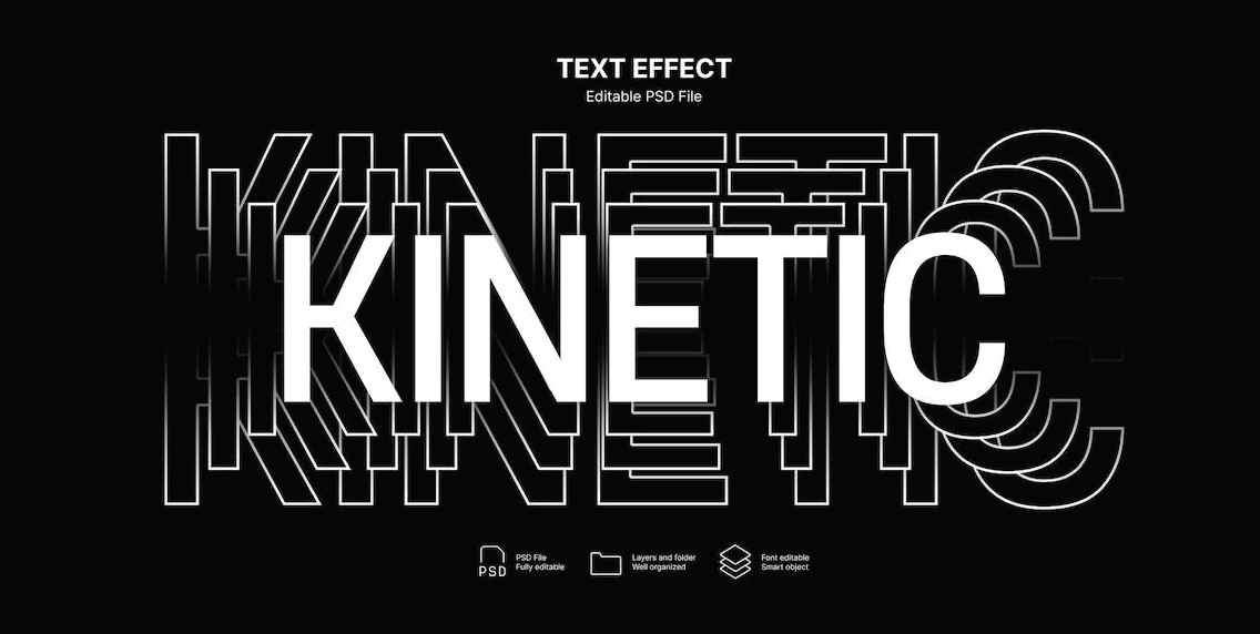
What it is: Type that moves—whether it pulses, fades, scrolls, or bounces.
Why it works: Motion turns static reading into a dynamic experience.
Use it for: Onboarding flows, microinteractions, explainer videos, or scroll-based storytelling.
INKLUSIVE Insight: We love kinetic type for CTA transitions on landing pages. A subtle hover animation on a “Book a Demo” line can make that small moment feel thoughtful and alive—just like your brand.
3. Handwritten & Signature Fonts
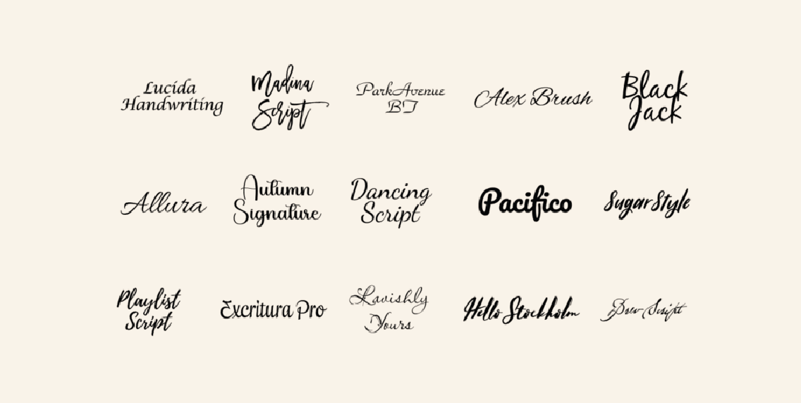
What it is: Fonts that mimic handwriting—raw, personal, sometimes a little rough around the edges.
Why it works: They convey authenticity and warmth.
Use it for: Founder-led brands, creator identities, journaling products, or storytelling-focused content.
INKLUSIVE Insight: We often blend handwritten fonts with ultra-clean UI to introduce a human touch into corporate content—great for sustainability brands and social ventures who need to sound personal, not polished.
4. Display Typography
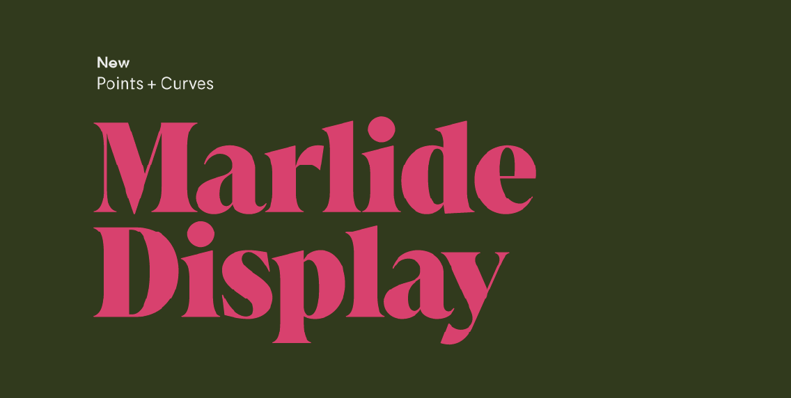
What it is: Large, bold fonts designed to make a statement, not to blend in.
Why it works: It becomes a focal point—ideal for campaign headlines, packaging, and lead banners.
Use it for: Keynotes, ads, social carousels, and websites with minimal text.
INKLUSIVE Insight: When we create pitch decks, we use display typography to break monotony—turning section dividers into visual breaks that feel almost editorial.
5. Layered or Overlapping Text
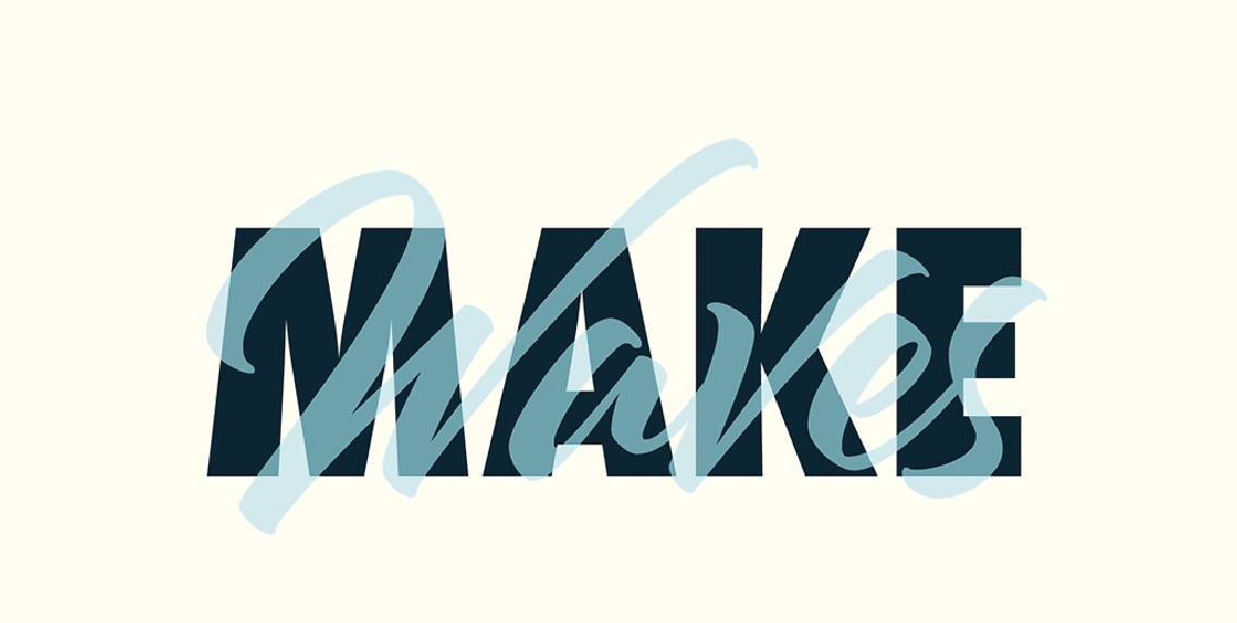
What it is: Words or letters that intersect or stack for artistic flair and meaning.
Why it works: It creates depth and gives your copy multiple visual layers—literal and metaphorical.
Use it for: Editorial posters, brand art, and visual storytelling.
INKLUSIVE Insight: We used this in a rebranding project where two business verticals needed visual cohesion. Layering helped express synergy and duality—without saying a word.
6. Typographic Shapes
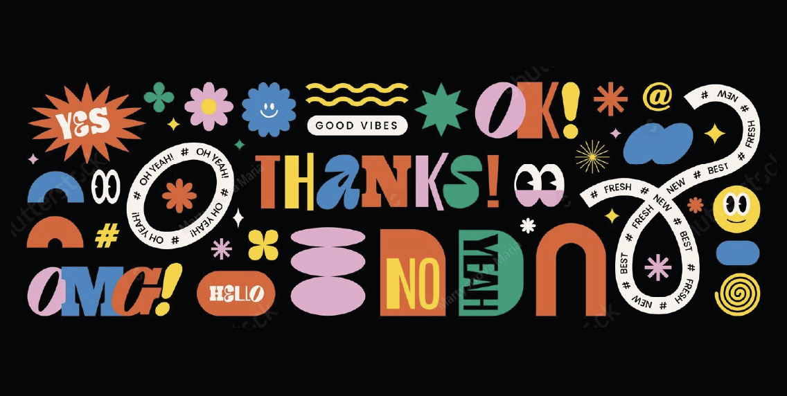
What it is: Wrapping or setting text inside shapes—circles, triangles, spirals, you name it.
Why it works: It creates movement and hierarchy, helping the eye travel naturally.
Use it for: Logos, data visualizations, icons, or dynamic section breaks.
INKLUSIVE Insight: For a global sustainability firm, we shaped their core value statements into circular diagrams—using typography to frame their impact themes and visually anchor the layout.
7. Variable Fonts
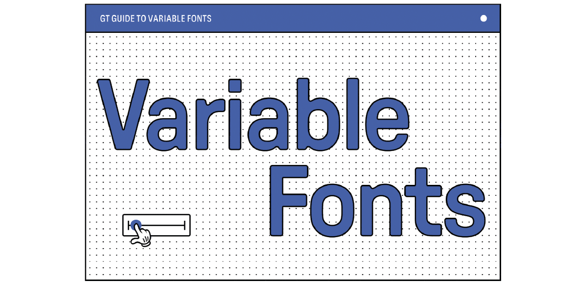
What it is: A single font file that can morph across styles—weight, width, contrast—without switching files.
Why it works: They’re scalable, responsive, and efficient. Great for interactive design systems.
Use it for: Web design, dashboards, app UIs, or any platform requiring adaptive text.
INKLUSIVE Insight: We use variable fonts in our design systems for clients with multiscreen ecosystems—ensuring brand consistency across mobile, desktop, and print from just one core file.
8. Y2K & Chrome Text Effects
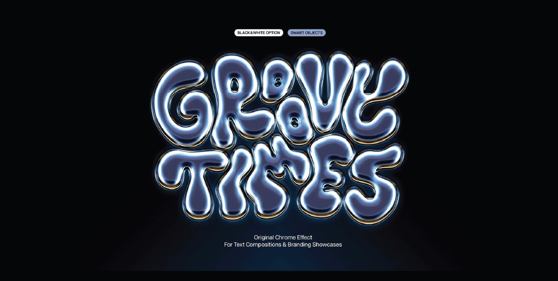
What it is: Retro-futuristic, shiny, glitchy fonts with neon vibes and visual noise—think 1999’s digital dreams.
Why it works: It’s nostalgic, energetic, and taps into current youth culture.
Use it for: Events, music branding, streetwear, gaming, or TikTok campaigns.
INKLUSIVE Insight: We use these styles sparingly and strategically in social campaigns where attention spans are short and bold aesthetics win. These fonts are like hot sauce—just the right amount turns up the flavor.
9. Grid-Aligned Typography

What it is: Fonts locked to a rigid design grid—perfect verticals, horizontal alignment, and typographic symmetry.
Why it works: It feels balanced, calm, and trustworthy.
Use it for: Finance, law, analytics platforms, and corporate layouts.
INKLUSIVE Insight: Our AB InBev book used a strong grid-aligned type to navigate dense content. It helped establish trust and flow across hundreds of pages, making the read as immersive as the visuals.
10. Minimal & Monospaced Fonts
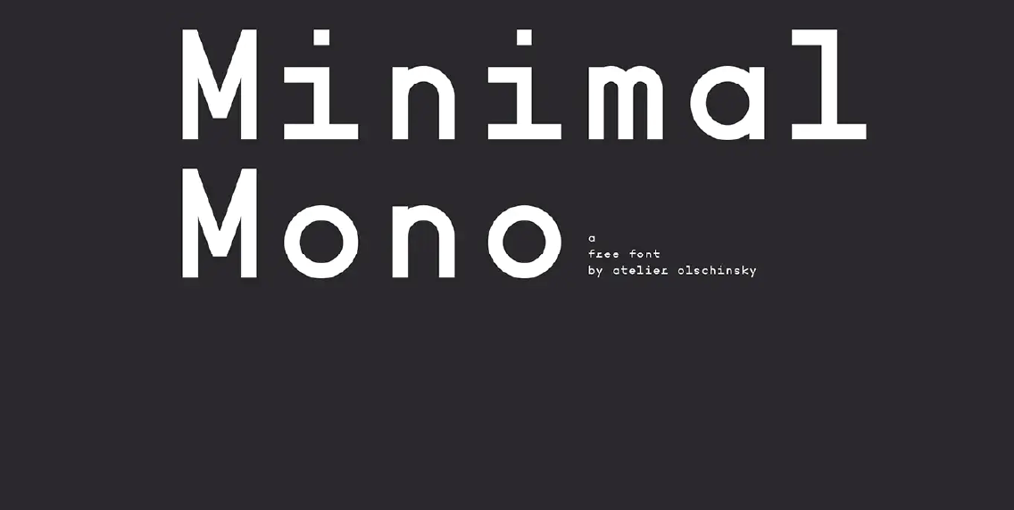
What it is: Clean, code-friendly fonts where each letter has equal width, often paired with generous white space.
Why it works: They signal technical precision and modern restraint.
Use it for: Developer sites, blockchain brands, and minimalist web UIs.
INKLUSIVE Insight: We recommend monospaced fonts when brands want to signal precision, clarity, and innovation. These fonts are quiet but powerful, like confident brands that don’t need to shout.
INKLUSIVE Case Studies: Typography in Action
AB InBev Coffee Table Book
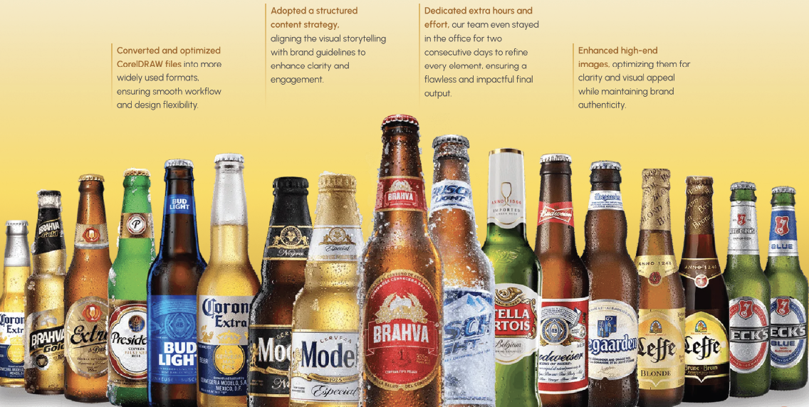
Typography as Brand Voice in Print
When AB InBev approached us, they didn’t just want a coffee table book—they needed a brand storytelling experience. Something powerful enough for the boardroom, yet elegant enough for a CEO’s desk.
What We Did
- Established a Brand Font System: Not just layout fonts—we defined the typography system that would echo across AB InBev’s ecosystem.
- Intentional Typography, Not Ornamentation: Every choice reinforced content clarity, guided narrative flow, and created a meaningful visual hierarchy.
Typography Choices
- Refined Serif Font: Evoked legacy and heritage.
- Modern Sans Serif: Brought in contrast, boldness, and modern appeal.
- Editorial Typographic Hierarchy: From headlines to pull quotes, everything was crafted for a smooth, immersive read.
The Result
- Typography as Experience: Reader’s eye didn’t just read the book, they felt the brand voice.
- Design That Built Trust: Typography moved beyond aesthetics; it elevated storytelling into a premium brand moment.
Why it Worked: Typography became the anchor. It unified the book, expressed brand personality, and turned static print into a storytelling experience that built trust and captured attention.
Carrier Sustainability Landing Page
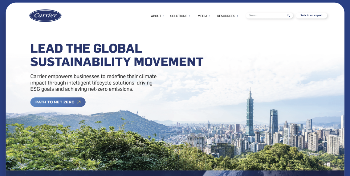
Typography-led Digital Design Built for Conversions
Carrier had great data and strong sustainability goals—but needed a landing page that transformed complexity into clarity.
The Challenge
- Dense, technical language.
- Audience: CXOs and decision-makers.
- Goal: Drive conversion and credibility.
Typography-First Approach
- Three Fonts, Three Functions:
- Bathilda Regular: Brought character and emphasis.
- Gotham Regular: Delivered executive polish.
- Roobert Regular: Warmed up body copy for readability.
- Strategic Hierarchy:
- Bold headlines for fast scanning.
- Calm, accessible body copy for deeper engagement.
- Clear CTA flow, guiding users toward booking a discovery call.
Built with Accessibility in Mind
- WCAG-Compliant Design: Font sizes, line spacing, and color contrast were optimized for readability on all devices.
- Responsive Experience: As impactful on mobile as on desktop.
The Result
- Typography Translated Value: What was once complex became simple, credible, and conversion-optimized.
- Type Drove Action: Visitors didn’t just understand the content—they acted on it.
Now It’s Your Turn
You’ve seen what typography can do when it’s treated as strategy, not just style.
Want typography that doesn’t just look good but drives real results?
Let’s design a visual experience that speaks louder than words.
Web Design vs. Print Typography: What Designers Get Wrong
Typography isn’t one-size-fits-all, as poor choices like bad kerning can lead to readability issues. Designers often misapply print principles to digital mediums, leading to readability and performance issues.
Key Differences:
- Performance: Web typography must consider file sizes. Using multiple font weights and styles can increase load times. Optimizing font loading strategies, such as using font-display: swap, can enhance performance.
- Readability: Screen resolutions vary, making certain print-optimized fonts hard to read online. Sans-serif fonts are generally more legible on screens.
- Responsiveness: Web typography must adapt to various screen sizes. Using relative units like em or rem ensures scalability across devices.
INKLUSIVE’s Approach:
We tailor typography to the medium.
For print, we might use intricate serif fonts with tight kerning.
For the web, we prioritize legibility and performance, selecting web-safe fonts and optimizing loading strategies.
Designing for Accessibility Without Losing Aesthetic
Accessible design ensures inclusivity without compromising aesthetics.
Key Considerations:
- Contrast: Adequate contrast between text and background is crucial. The W3C recommends specific contrast ratios to ensure readability.
- Font Choice: Simple, sans-serif fonts enhance legibility. Avoid overly decorative fonts for body text.
- Overall Spacing: Proper line spacing and letter spacing improve readability, especially for users with dyslexia or visual impairments.
INKLUSIVE’s Strategy:
We integrate accessibility from the outset, ensuring that clever use of typography is stylish and inclusive. Our designs adhere to WCAG guidelines, ensuring that typography is both stylish and inclusive.
Typography That Feels Like Your Brand: Font Psychology 101
Fonts convey emotions and brand personality.
Font Categories & Associated Traits:
- Serif: Trustworthy, traditional. Ideal for legal or financial institutions.
- Sans-Serif: Modern, clean. Common in tech and startups.
- Script: Elegant, personal. Used in luxury branding.
INKLUSIVE’s Method:
We align typography with brand identity. For instance, a playful brand might use rounded sans-serif fonts, while a premium brand might opt for elegant serifs.
Why here?
This section builds a strong emotional case around typography and brand identity—ideal timing to pitch INKLUSIVE’s strategic approach.
Typography Design Ideas That Actually Make a Difference
Practical Tips:
- Font Pairing: Combine contrasting fonts (e.g., serif with sans-serif) for hierarchy.
- Licensing: Ensure fonts are properly licensed to avoid legal issues.
- Kerning & Leading: Adjust spacing for optimal readability.
INKLUSIVE’s Best Practices:
We prioritize clarity and user experience, ensuring that typography choices enhance content without overshadowing it or clashing with other design elements.
Final Thoughts
In a world overwhelmed by content, typography plays does the heavy lifting quietly. Before your visuals land and long before your message is read, your font speaks first and often loudest. Whether it’s the confident boldness of a sans serif on a fintech dashboard or the poetic elegance of a handwritten script in a sustainability pitch, typography sets the tone, defines your personality, and builds instant trust.
Think of it this way: typography is your brand’s non-verbal handshake. It tells your audience whether you’re here to disrupt, reassure, inspire, or lead without uttering a word.
That’s why at INKLUSIVE, we approach typography not as a stylistic checkbox, but as a powerful psychological and strategic tool. We don’t just pick fonts we craft experiences that feel like your brand. From immersive coffee table books to digital-first landing pages built for conversion, our own work blends emotional depth with functional clarity.
Your typography isn’t just about being readable. It’s about being rememberable.
Because in the end, great typography doesn’t just support your message it becomes part of it.
INKLUSIVE doesn’t just design fonts. We design feelings.
And that’s the difference between looking good and making people feel something.
Ready to Make Your Brand Feel Something?
If you want typography that goes beyond readability and builds emotion, trust, and recall, INKLUSIVE can help you craft experiences that truly connect.